

We’ve all heard it said: “It’s an outlier”. But what does that mean, and what should we do about it - if anything?
Read More
The “Melt” function is used to convert data tables from a “wide” format to a more analyzable “long”, or “tidy” format.
Read More
What do the terms Data Science and Data Literacy mean? Are they interchangeable? Here’s my take.
Read More
Not often we do a blog post that’s a kind of “how to”, but the simple multiple line graph illustrates some important points regarding data formatting and Tidy Data, which are important aspects of Data Literacy and useful for all kinds of data analysis.
Read More
What do I mean, playing? Sounds a bit trivial.
Maybe exploring is a better word. We’re talking about the process of experimenting with different visualizations, to see:
What insights can we get from the “shape” of the data
What might be the next avenue of inquiry?
I strongly believe that such activities are key to achieving actual data literacy.
Read More
DataClassroom is often used for analyzing results of surveys. What are the pitfalls to avoid when designing a survey, and what are best practices?
You are going to want to analyze the results afterwards in order to draw conclusions, so make it easy on yourself.
Read More
There was a theory once, that given that antioxidant molecules at the cellular level can act to remove free radicals that induce cell damage, that eating supplements with antioxidants might have beneficial health effects, especially on aging related problems like heart attacks, or on cancer.
It turned out that this wasn’t the case - quite the opposite in fact.
Read More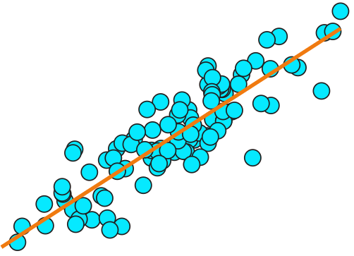
While demonstrating our Simulator the other day, we realized that it includes a really great way to play with and develop an intuitive understanding of what an R-squared (r2) value represents.
How? Well, it includes an interactive interface to specify the relationship between two variables, which in turn will define the R-squared value of the resulting data.
Read More
Really want to make a difference in the world? Well, read on to find out about how some scientists are literally saving lives, just by analyzing data.
Read More
Why is understanding data types so important, and why can it be difficult? When is a number categorical? Why are dates problematic?
Having data organized by variable, and knowing what type each variable is, is very important, as it guides (or limits) the mathematical tests you can perform.
Thinking about data types before performing an experiment can make the work afterwards a lot easier!
Read More
The DataClassroom interactive T-test is designed to give a visual, intuitive understanding of what the test is actually doing, all the way from looking at the mean values of your data to generating, and interpreting, the P-value that is the result.
This post describes the various pedagogical details in the design, and the thinking behind them.
Read More
We know it can be difficult getting on top of the important data analysis phase of an experiment. You’ve got a load of measurements, but how to arrange them? Maybe you’ve read our articles on Tidy Data - this helps - but now there is another tool to assist you.
By running a DataClassroom simulation, you can nail down what your experimental variables are, think more deeply about what you are measuring, and try out visualizations and ways to analyze - all before you go to the lab!
Read More
Let’s say you want to know if a treatment or category affects an outcome. Could be anything. Does a new pill reduce bloodpressure? Are left-handed people more athletic?
There is an answer, but it is hidden inside the bodies of the subjects. How to get that answer out of them?
And when experimenting, how do you ensure you can get a significant result?
We know this can be hard to teach, and DataClassroom Simulations can help.

I’ve always thought there was something inherently attractive about the normal distribution, aka the “bell curve”.
But how many samples do you need to get that nice smooth curve?
And what does that tell us about how we evaluate significance of results?
Read MoreMagic is not always great. Especially in the learning process, it’s not a good thing if finished results just pop out of a tool - like magic!
But were our Graph-Driven Tests maybe doing too much behind the scenes? And what did we do about it?
Read More
The R Project is fantastic. With it, you can do virtually any data visualization or analysis task - and it is free and open source.
But it’s probably not controversial to say that learning to code in R can be pretty intimidating for many.
Our Bridge to R feature provides scaffolding to give learners a great starting point.
Read More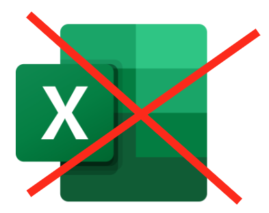
There is a misconception that students should use spreadsheets for everything - because “that’s what they’ll be using when they are in the workplace”.
But scientists don’t generally use spreadsheets for visualization and analysis. And there’s a reason for that.
Read More
Two new features we’d like to tell you about today:
Plotting residuals (and slopes) from regression lines
Plotting a reference normal curve on histograms, and testing for normality.
Read More
Sometimes your data need a bit of tweaking. Not to falsify your results (of course!) but maybe they need to be in different units of measurement, or you want to convert a linear measurement into an area.
Read More
We just added a whole bunch of new color scales to the app, so you can color-map your graphs with even more color schemes with spicy names like Magma and Viridis…
Read More