Playing with data
What do I mean, playing? Sounds a bit trivial.
Maybe exploring is a better word. We’re talking about the process of experimenting with different visualizations, to see:
What insights can we get from the “shape” of the data
What might be the next avenue of inquiry?
I strongly believe that such activities are key to achieving actual data literacy.
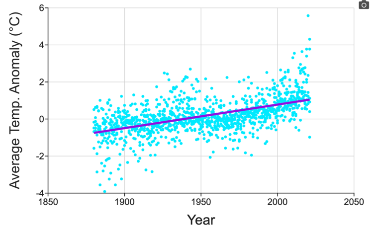
For example, our Feeling the Heat Ready-to-Teach dataset activity suggests the following graphs:


By navigating through their data, a student or researcher can get a feel for what the data are saying (Yes, we actually hear this phrase when talking to teachers). They can also develop the fundamental insights that are key to what I’d call literacy, for example:
There is no one “right” way to look at data
Some visualizations might be concealing “hidden secrets”
Outliers exist - you need to think about how to treat them
They might also start getting creative, and be inspired to think of other questions the data might be able to answer. Or really get involved in discussing the meaning of the results of their analysis, and what other investigations they could do. Some of the best moments in my day are when we hear back from a teacher, new to DataClassroom, who has just experienced of their students behaving in this way (for the first time!) and just feel they have to share it with us.
So how do we get to ‘play’?
You can’t play with something unless it is easy to deal with. No-one wants to kick a soggy, deflated football.
Removing difficulty is the key goal of DataClassroom. Sure, it’s possible to make the above graphs in Excel or Sheets. But it is laborious. Those are generic tools, not focused on the actual task in hand, so it takes a long time (and maybe some googling) to work out how to get to any one of them.
If you just spent half an hour making a visualization, what’s the chance you’ll drop it and try another option, out of curiosity?
Shouldn’t it be difficult, though?
Interestingly, another form of user feedback we sometimes hear - from students - is along the lines of “isn’t this too easy?”.
The teacher or professor is really happy - they just spent the time with their students doing really high-value activity, discussing the experiment and the meaning behind the data, because the students didn’t have to expend half their time (and motivation) just fighting with a tool. They know what it used to be like!
But sometimes you’ll see a comment from a student: “It felt like the tool did all the work for me. Shouldn’t I be learning to do this in Excel?”
Which is indeed ironic, because if they really make a career in science, they’ll actually want to be fluent in using professional analytics tools, which resemble DataClassroom in terms of features.
But the positive thing is of course that this probably means that they actually absorbed more knowledge than they realized - and at a different level than they were expecting.
Do you have an experience to share? Let us know at info@dataclassroom.com - we’re always interested to hear what you’re up to!