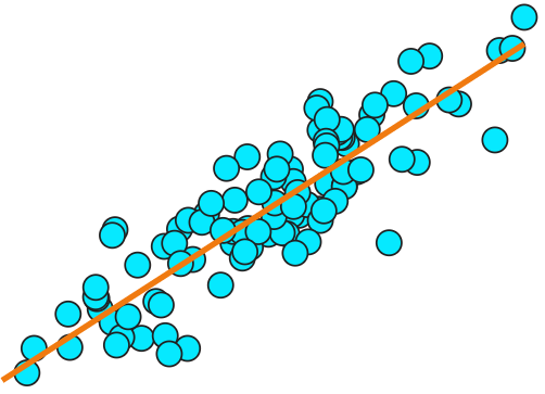
Three questions. Any Graph. Every Week.
Read MoreWelcome to our blog. Here you can find updates on new developments, tips & tricks, and guides on how to get started with DataClassroom.
Three questions. Any Graph. Every Week.
Read MoreWhy won’t your student’s graph work? Check out this post on how to - tidy - up the data using DataClassroom
Read MoreLooking for examples of different kinds of regression lines? We’ve got a collection to cover them all.
Read MoreThree ways data visualization is imperative for analysis: discover the whole story by excluding data, use graphs to steer toward the right questions, and clarify the story by altering the look.
Read MoreThe terms “line graph” and “graph with line of best fit” (or regression line) are sometimes mistakenly used by students in an interchangeable way. Because these graphs may initially look quite similar to our students, it can be very helpful to students to explicitly point out the differences. Being clear and direct as you define these graph types for students will help them to understand what the data in these two very different graph types are saying.
Read MoreDataClassroom designs Classroom-Ready activities with the modern classroom in mind, aligning our modules with Next Generation Science Standards and Common Core State Standards. We’re excited to announce our array of Classroom-Ready activities modeled on the AP Biology Investigative Labs!
Read MoreWhat graphs are best for your data? Explore all the possibilities in this helpful blogpost.
Read MoreExplore our collection of raw data. Each includes a generic set of questions for students to use along with a short background on the dataset.
Read MoreThe correlation matrix is a great way to visualize patterns in your data, when you have a lot of variables.
With the ability to color the squares in the matrix according to the correlation coefficients, any interesting results should just pop right out at you. But there are pitfalls!
Read MoreWe’ve all heard it said: “It’s an outlier”. But what does that mean, and what should we do about it - if anything?
Read MoreThe “Melt” function is used to convert data tables from a “wide” format to a more analyzable “long”, or “tidy” format.
Read MoreWhat do the terms Data Science and Data Literacy mean? Are they interchangeable? Here’s my take.
Read MoreNot often we do a blog post that’s a kind of “how to”, but the simple multiple line graph illustrates some important points regarding data formatting and Tidy Data, which are important aspects of Data Literacy and useful for all kinds of data analysis.
Read MoreWhat do I mean, playing? Sounds a bit trivial.
Maybe exploring is a better word. We’re talking about the process of experimenting with different visualizations, to see:
What insights can we get from the “shape” of the data
What might be the next avenue of inquiry?
I strongly believe that such activities are key to achieving actual data literacy.
Read MoreDataClassroom is often used for analyzing results of surveys. What are the pitfalls to avoid when designing a survey, and what are best practices?
You are going to want to analyze the results afterwards in order to draw conclusions, so make it easy on yourself.
Read MoreThere was a theory once, that given that antioxidant molecules at the cellular level can act to remove free radicals that induce cell damage, that eating supplements with antioxidants might have beneficial health effects, especially on aging related problems like heart attacks, or on cancer.
It turned out that this wasn’t the case - quite the opposite in fact.
Read MoreWhile demonstrating our Simulator the other day, we realized that it includes a really great way to play with and develop an intuitive understanding of what an R-squared (r2) value represents.
How? Well, it includes an interactive interface to specify the relationship between two variables, which in turn will define the R-squared value of the resulting data.
Read MoreReally want to make a difference in the world? Well, read on to find out about how some scientists are literally saving lives, just by analyzing data.
Read MoreWhy is understanding data types so important, and why can it be difficult? When is a number categorical? Why are dates problematic?
Having data organized by variable, and knowing what type each variable is, is very important, as it guides (or limits) the mathematical tests you can perform.
Thinking about data types before performing an experiment can make the work afterwards a lot easier!
Read MoreThe DataClassroom interactive T-test is designed to give a visual, intuitive understanding of what the test is actually doing, all the way from looking at the mean values of your data to generating, and interpreting, the P-value that is the result.
This post describes the various pedagogical details in the design, and the thinking behind them.
Read More