Excel in the science classroom? Go one better.
Now don’t get me wrong. Spreadsheets are excellent tools, and for the things they’re designed to do, they are awesome. They are great for organizing data, for example. But for data analysis and visualization by science students they have some serious shortcomings.
“But they need to learn to use Excel - for their future”
There is a misconception that students should use spreadsheets for everything - because “that’s what they’ll be using when they are in the workplace”.
True enough if they are going to be working in Accounts. But scientists don’t generally use spreadsheets for visualization and analysis. And there’s a reason for that.
The right tool for the job
Real scientists studying environmental data, polls of social attitudes, biological phenomena, medical treatments and so on use dedicated professional tools like R, Python or SPSS that provide the functions they need, and these functions are not easily available in Sheets or Excel.
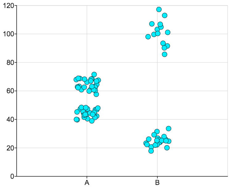
For example, neither of them can readily perform the one most ubiquitous and valuable data sample visualization, the jittered dot plot.
Yes, I’m a big fan of the dot plot, as mentioned in this earlier blog post. But I’m not alone. Real scientists also push for greater usage of this as best practice.
And yes, with a great deal of work and some clever formulæ, you can get the spreadsheets to produce something close. Try Googling ‘dot plot in Excel’ to get an idea of what it takes. Then think about whether that looks like something you want to have your students go through. Every time.
But even if you decided that your students’ souls would benefit from some suffering and wanted to put them through all that just to make a simple graph, as soon as they got more ambitious and wanted to add error bars, box-and-whiskers annotations, regression lines, or (heaven forbid) actually do some hypothesis testing, they would soon realize that this is yet another level of additional functionality that these (otherwise excellent) tools just aren’t designed to provide without even more hand-coding.
These days, you almost never see a graph from Excel in a scientific paper.
So what to do?
The great news is - if you were one of those thinking that students “ought” to be using spreadsheets for everything - it just isn’t true. As mentioned, scientists don’t use them for analysis, so your students wouldn’t actually derive any future benefit from all that hassle. You can move on to using more purpose-built tools with a clean conscience.
And guess what - it’s actually a lot more enjoyable using a tool that’s designed to do exactly what you’re using it for. Ask any auto mechanic or carpenter!
The next challenge is finding a tool that provides all this functionality, but does not require $$$$ or months of training to master its complexities.
A tool that:
Has a suitable complexity level for the classroom
Is designed with pedagogy in mind - to actively assist the student in the learning process
Is reasonably priced
Interoperates with educational IT systems
Is a stepping-stone towards using professional tools
Is that possible?
When we talk to our existing customers (K12 teachers and college instructors), what we hear is that we’ve nailed it.
“Data analysis now becomes the exciting part of the day!”
“Students become more secure with their data skills and their confidence increases ... it changes everything.”
Give it a go and try DataClassroom today!
If this sounds like what you’ve been waiting for, register for a free trial of DataClassroom, have a browse through the searchable User Guide, watch one of our videos or get in touch and see how we can help!