
Types of Bar Graphs

Bar graph is an overworked term. Here’s the precise vocabulary that actually helps students choose the right graph.
With a special bar graph printable below!
Ask a student to make a bar graph and they'll make one. Ask them which kind of bar graph fits their data, and you'll often get a blank stare — or worse, a default graph that doesn't answer their question.
The problem isn't that students can't make graphs. It's that "bar graph" is doing too much work. It's one term trying to cover eight meaningfully different graph types. And when students don't have the vocabulary to distinguish between them, they end up either shoehorning data into a familiar format or asking for help without being able to describe what they need.
Watch this clip of Aaron explaining the nuance:
The solution is a shared vocabulary — a visual glossary that students and teachers can use together. Below is that glossary, organized around a simple framework: how many variables are you working with, and what are you trying to show?

One Variable: Showing the Distribution of One Thing
When you're working with a single variable, you're asking: what does this data look like? How is it distributed? The three graphs below all answer that question — but in different ways depending on whether your variable is numeric or categorical.
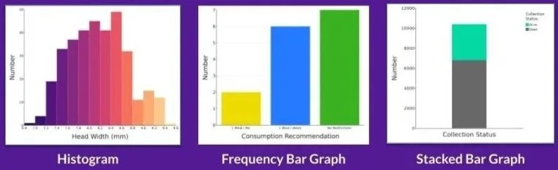
Histogram: Shows the shape of a numeric variable’s distribution.
Frequency Bar Graph: Shows how many observations fall into each category. The go-to Graph for categorical data. What most students picture when they say “bar graph”
Stacked Bar Graph: A cousin of the frequency bar graph. Instead of bars side by side, they’re stacked on top of one another - useful when you want to show parts of a whole.
The key distinction to teach students: if your x-axis variable is numeric (like head width in millimeters), you're making a histogram. If it's categorical (like species or treatment group), you're making a frequency bar graph. These are not interchangeable.
Two Variables: Comparing or Combining Two Things

Add a second variable and your options expand. The five graphs below all involve two variables, but they each answer a different kind of question.

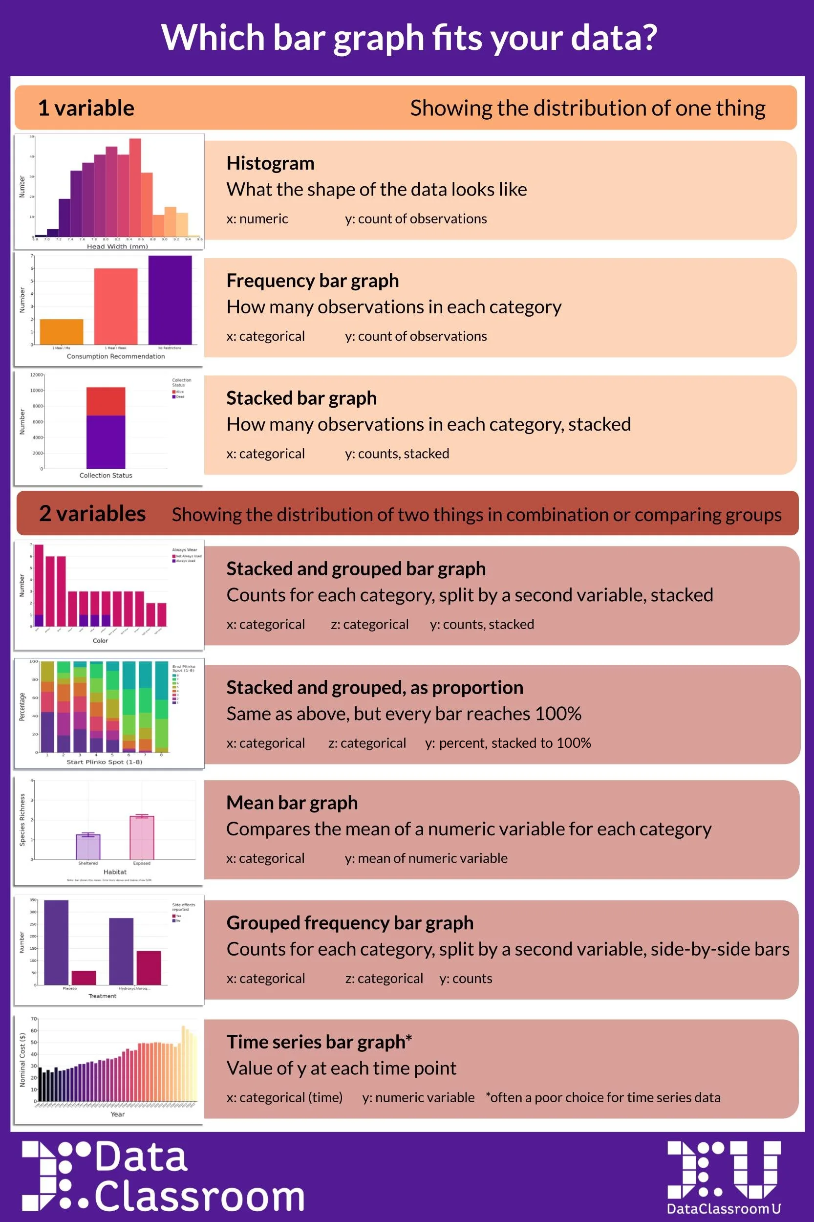
Stacked and Grouped Bar Graph: Shows counts for each category, split and stacked by a second categorical variable.
Stacked and Grouped, as Proportion: Same as above, but every bar is scalled to 100% - useful when groups have different sample sizes and you want a fair comparison
Mean Bar Graph (Dynamite): Shows the average of a numeric variable for each category. The height of the bar is the mean - which is why it must include error bars or raw data.

Grouped Frequency Bar Graph: Shows counts as side-by-side bars for each combination of two categorical variables. Sometimes called a 2x2 (or 3x4, or 5x6…depending on the number of groups)
Time Series Bar Graph: Each bar represents a time point. Useful in limited cases - but often a line graph communicates change over time more clearly.
Once students know the vocabulary, the next step is learning to apply it. The poster below is a practical decision framework organized by the number of variables and the question being asked. It's designed to be used as a reference — something students can consult when choosing a graph type, and something teachers can point to when giving feedback.
Click to get the PDF for free!
Interested in a bit more?
Check out more Statistics Snippets.
Subscribe to the Statistics Snippets playlist on Youtube.