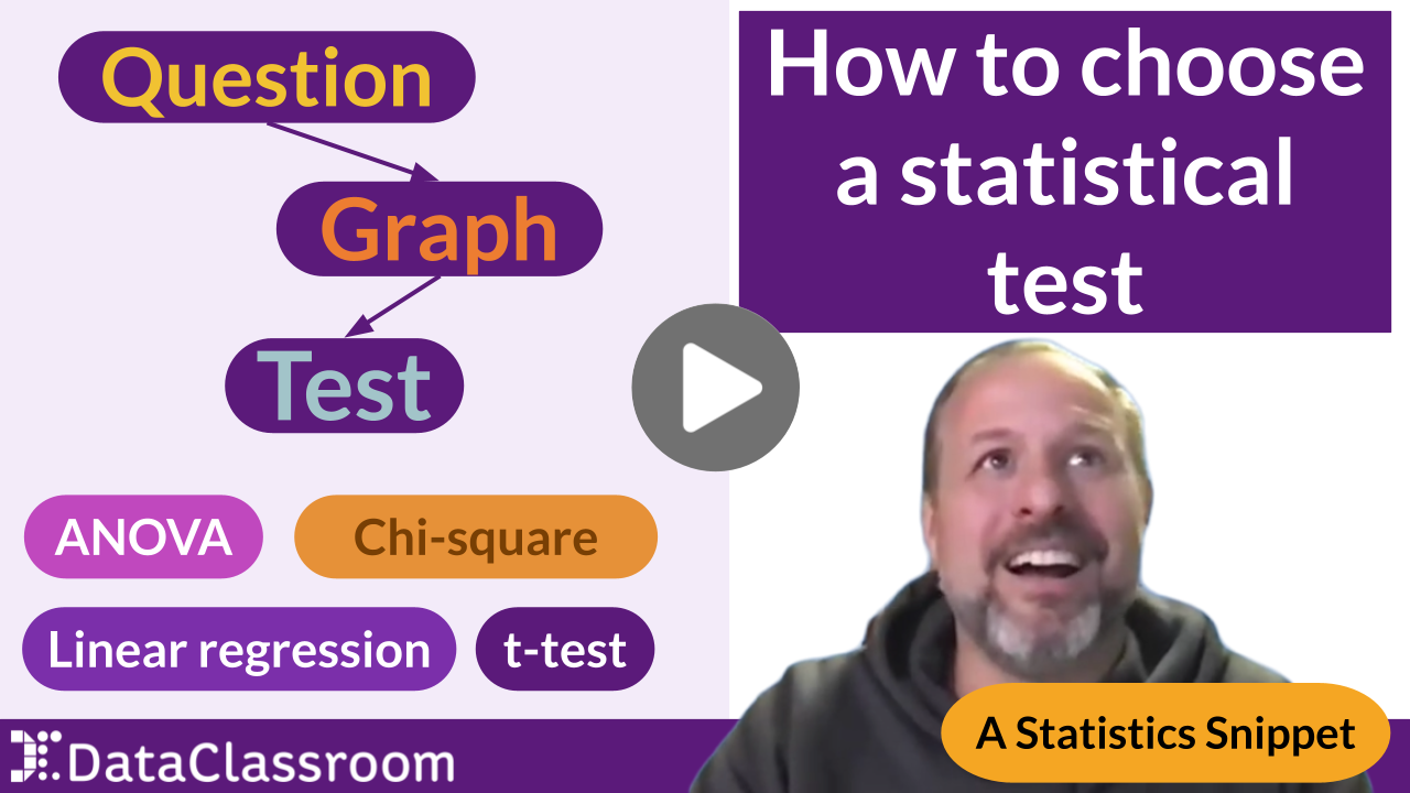
Most students stop at the default. They let the software spit out a graph, slap it in their lab report, and call it done. But a graph that is technically correct and a graph that actually communicates are two very different things. In this post we break down the difference between a graph that is clear — accurate, readable, honest — and one that is loud — intentional, persuasive, memorable. Using a real biodiversity dataset, we walk through every design decision that turns a forgettable default plot into a figure worth putting in a publication.
Read More"Types of bar graphs" covers far more than students realize — frequency bar charts, bars of means, histograms, grouped and stacked bars, and more. This guide breaks down eight bar graph types, when to use each, and how precise vocabulary helps students make better graphs. For science and math teachers in grades 6–12, AP Biology, and IB Science.
Read MoreMinimum and maximum gradients are one of the most searched — and most misunderstood — techniques in IB Physics. In this clip, we explain exactly how min/max gradient lines are drawn, why IB Physics uses them instead of a standard 95% confidence interval band, and how to add custom error bars using your own calculated uncertainty values.
Read MoreANOVA or linear regression — which statistics test should you use? In this clip, we run the same dataset both ways and show exactly how the results differ. When concentration is treated as a categorical variable, ANOVA tests whether group means differ. When it's treated as numeric, linear regression tests whether there's a relationship between the two variables. Both can be valid — the right choice depends on your hypothesis. Essential viewing for any student learning how to choose a statistical test.
Read MoreSummary statistics feel reassuring. The mean, the standard deviation, the R squared — if those numbers look right, the data must be fine, right? Not necessarily. The Datasaurus Dozen is a famous dataset designed to prove exactly that point: multiple groups of data can share nearly identical summary statistics while looking completely different when graphed. One of them is a dinosaur. In this post we break down what the Datasaurus Dozen reveals about data visualization — and why your students should always plot their data before drawing any conclusions.
Read MoreTidy data is the foundation of every major data analysis tool — R, Python, SPSS, and beyond. In this clip, we break down the three rules of tidy data: every variable gets one column, every observation gets one row, and every value has its place. We show the most common untidy spreadsheet mistake students make, and how to fix it. If your students are doing any kind of science data analysis, tidy data is where to start.
Read MoreMost students know how to read a data table. Far fewer know how to ask the right questions of one. The unit of observation — what each row in a dataset actually represents — determines every question you can legitimately ask of your data. Get it wrong and your entire analysis goes sideways. In this post we break down what the unit of observation is, why it trips up students (and teachers), and how to identify it quickly in any dataset.
Read MoreHow do you choose the right statistical test for your data? Whether you're deciding between a t-test and chi-square test, or just starting to learn statistics for biology, this video gives you a simple framework: start with your research question, choose the right graph, and the correct statistical test becomes clear. Based on a graph choice chart from The Science Teacher journal, this approach helps middle school, high school, and college students pick the right statistical test every time — for science fair projects, AP Biology labs, IB Science investigations, and beyond.
Read MoreWhat are degrees of freedom? This clip clarifies how changing degrees of freedom for a Chi-Squared test effects statistical outcomes.
Read MoreDo overlapping error bars mean your results aren't statistically significant? Not necessarily — it depends on which error bars you're showing. This post clears up one of the most common misconceptions in data analysis, explaining what overlapping standard deviation, standard error, and confidence interval bars really tell you. For science fair and AP Statistics.
Read MoreStandard error and the 95% confidence interval are often treated as interchangeable — but they're not. The rule that two standard errors equal a 95% confidence interval only holds at large sample sizes; at small samples they diverge sharply. This post explains the difference between SEM and confidence intervals for AP Statistics, IB Science, and biology students.
Read MoreWhat does standard deviation actually mean? In plain English, it's the typical distance a data point sits from the mean — a measure of how spread out your data is. This post explains standard deviation simply, with a visual example students can follow, and why it matters for any dataset. For science teachers, AP Biology, and anyone teaching data analysis.
Read More