Juggling Stacked Graphs Part 1
Vertical Ball Toss Lab
Part 1: single throw
Use stacked graphs to investigate distance, velocity, and acceleration.

Background
Looking at graphs of motion showing variables of position, velocity, and acceleration can show us exactly what is happening in the physical world. Just one graph can be helpful, but evaluating position, velocity, and acceleration graphs for the same moment in time can tell us so much more.
When it comes to perfecting the ball toss, jugglers spend hours trying to get identical throws. Only when they are perfectly comfortable with throwing one object can they move onto practicing with two, three, or more!
This dataset records a person practicing the first step of juggling - a ball tossed in the air and then caught. Jugglers must practice this simple step over and over to be able to get a feel for how far up they are tossing their objects and the timing of the catch.
Dataset

This is a classic ball toss lab, in which the data was gathered by tossing a ball over a motion detector, which recorded the location of the ball from the detector. You can recreate this using any commercial motion detector available through Vernier or Pasco.
Variables
Time - This numeric variable describes the moment in time that data was taken, every 0.05 seconds. Zero is when data collection began. Measured in seconds.
Position - This numeric variable describes vertical height (not any horizontal movement). The value of zero represents the ground. Measured in meters.
Velocity - This numeric variable describes the speed and direction the object was moving. Measured in meters per second.
Acceleration - This numeric variable describes the change in velocity over time, as well as the direction of that change. Measured in meters per second per second.
Activity
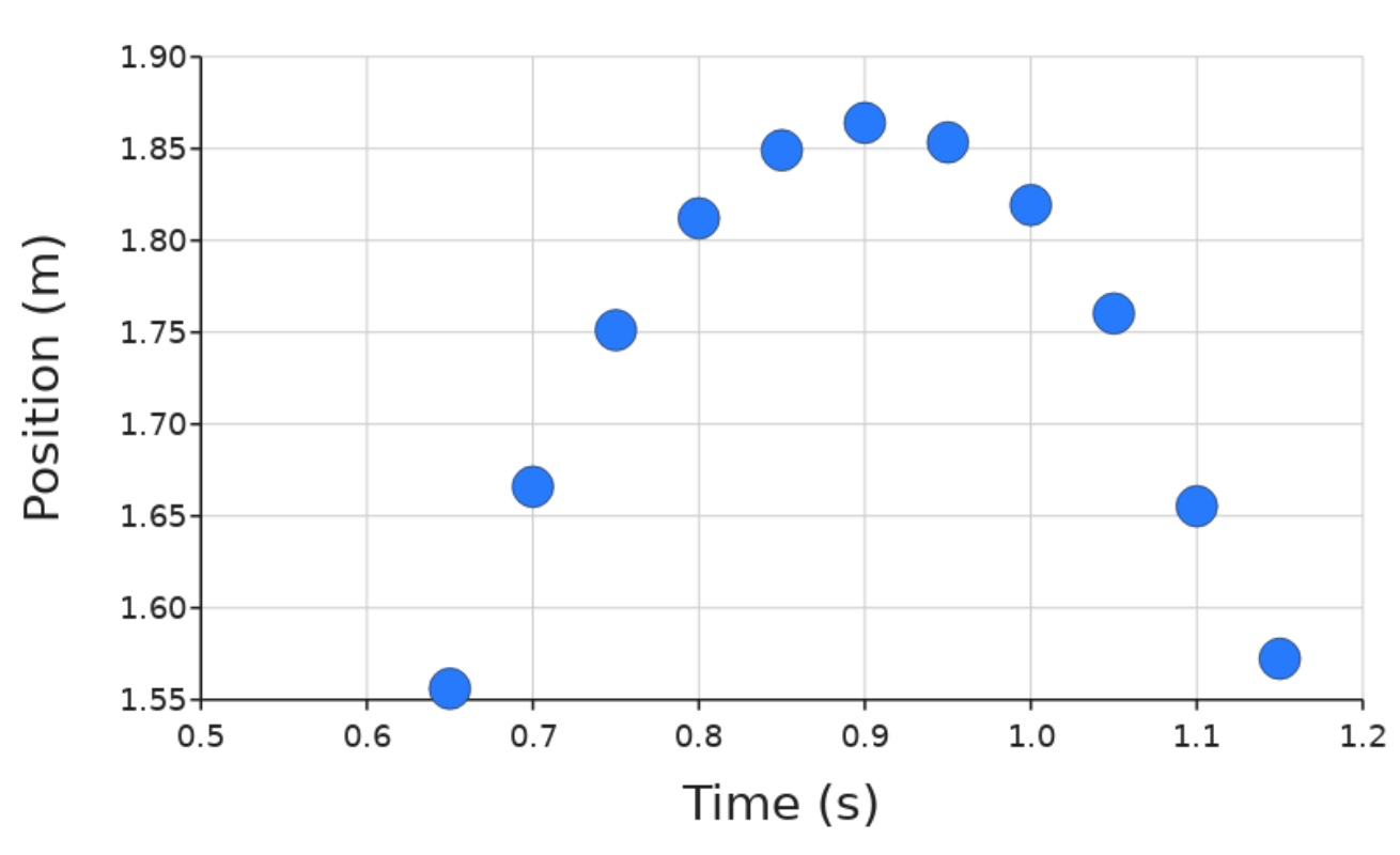
Part 1 - What data matters? Looking at Position vs. Time graph
Make a scatter plot so you can see the physical path the ball took over time:

2. Break the graph up into three sections, describing what is physically occurring during those sections.
3. Go to your table and exclude all rows of data that are not part of the “throw” section. You may make more adjustments to this as we go on.
Additionally, set the range of your X axis to zoom into just the points where the ball is in the air. Leave this axis range set for all your following graphs, and will not be changed. Allow the y-axis to be auto for each graph.
Paste your new graph here:
4. Click back to your graph, and add a regression line. If the linear regression does not seem like a good fit, you may need to change the type of regression line to find the best fit.
If you need to adjust your datapoint exclusions, click back to the table until you feel you really found the correct time of the toss. Include your new graph below:
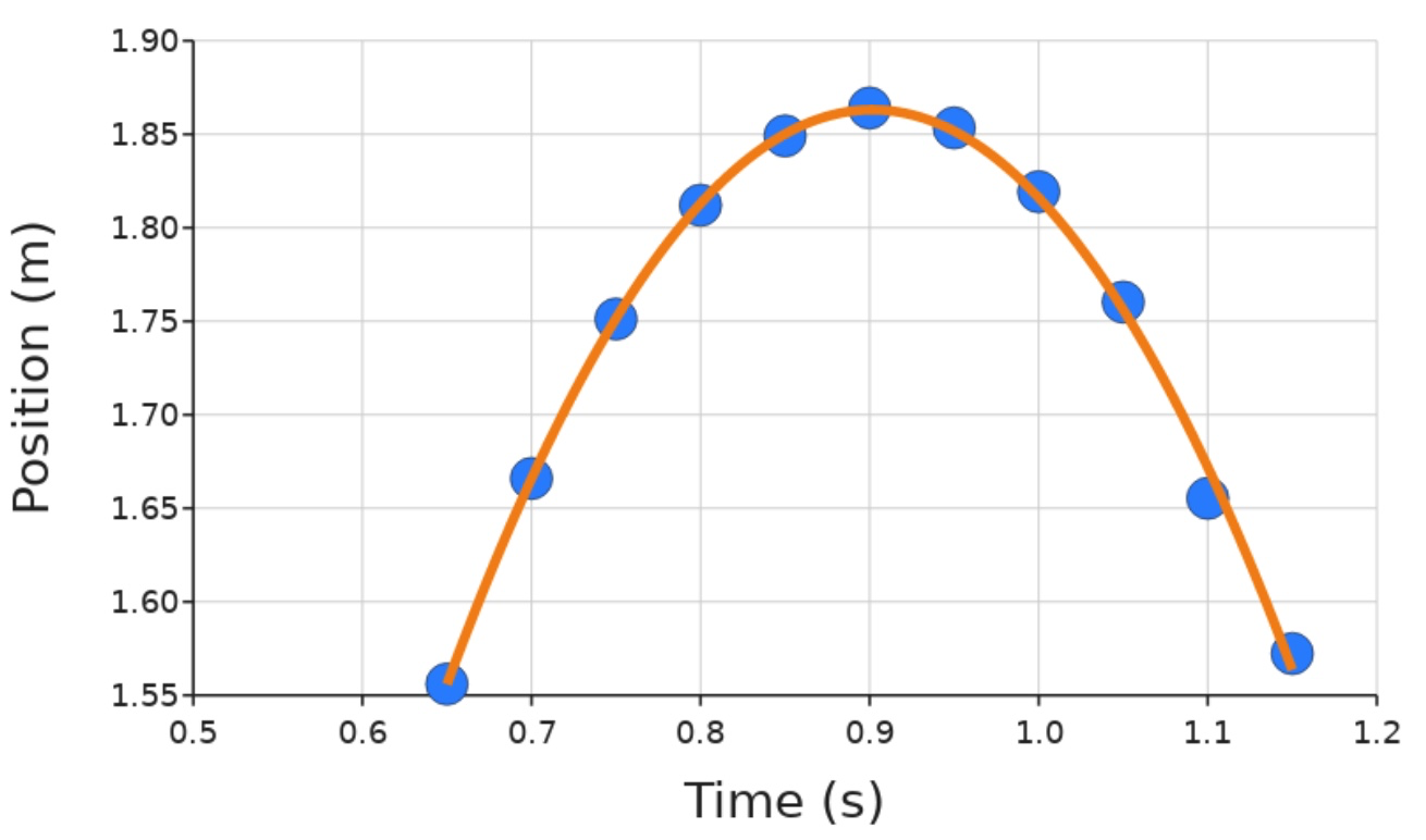
5. What equation fits your data best? Include that below:
6. Replace x and y in your equation with the actual variables that they represent.
Extension A: Compare your equation to the known equation of an object in free fall. What do your numerical values represent? Why might they be different from the theoretical values in our known equation?
Part 2 - What else is happening? Adding Velocity and Acceleration graphs
7. Predict: Based on your position graph, address when you think the following is happening (some may repeat, or have more than one answer):

8. Make a graph of velocity over time (keeping the excluded points from previously, and not changing the range of your X axis). You should still see your regression line - select which line fits best, and paste the graph below:

9. Do you need to exclude any more data points? Which do you want to exclude and why?
10. Exclude any data points that appear to be from the time points when the ball was not in the air, and paste your new graph below:

11. What equation fits your data best? Include that below:
12. Replace x and y in your equation with the correct variables and units
Extension B: Which kinematic equation did we just find? What values do you see represented in your data?
13. Create one more graph to look at how acceleration changes over time. Paste it below after removing the regression line:

Final Findings:
14. Copy/Paste your graph from #3 (position + regression line), #10 (velocity + regression line), and #13 (acceleration) below :
Note: Resize the images after pasting in below so the x axis all lines up

15. Looking at our stacked graphs, fill in the following summary table: NOTE: not all boxes may be filled.

16. If this was a perfect experiment with perfect data, what would we expect the acceleration graph to look like? (Hint: Think of what is creating the acceleration once our person lets go of the ball). Be as descriptive as possible.