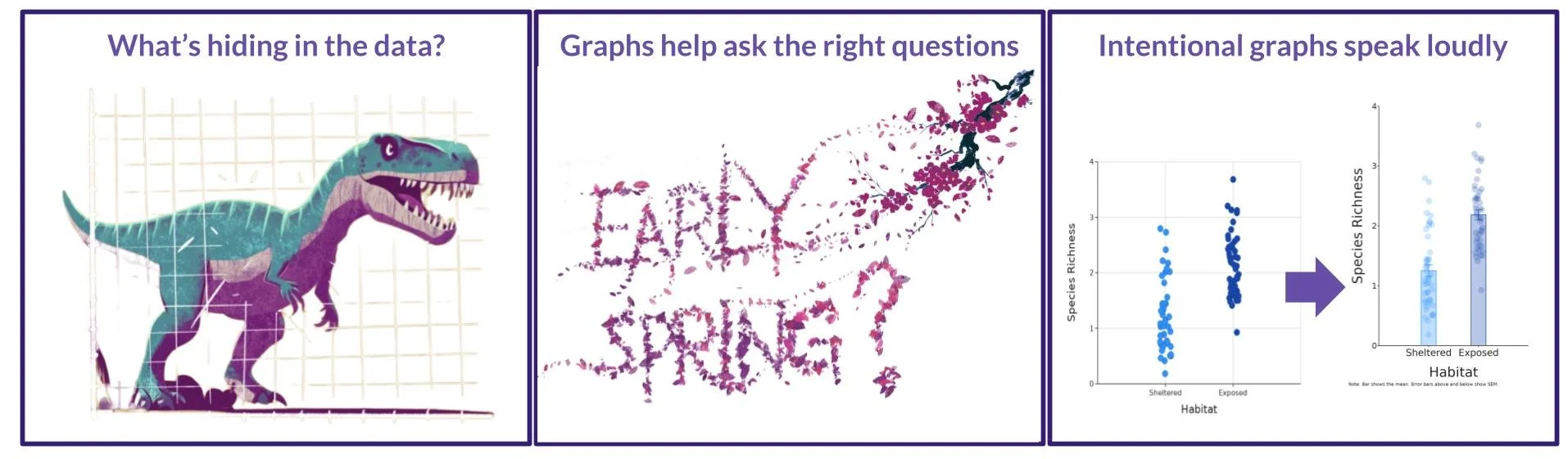
Data Visualization is a must for Analysis
Turn numbers into powerful narratives
No matter what level you are teaching or learning at, visualizing your data should be the first step when asking a question of your dataset. In this webinar for the Montana Department of Public Instruction, the educational advocacy group Data Science 4 Everyone invited Dr. Aaron Reedy of DataClassroom to help make the case for why data visualization is such an important data science skill for students of all ages. Have a look at this visual outline of the three reasons that Dr. Reedy gave for why data visualization is so important for students. Scroll to the bottom to see the recorded presentation!

A Dino hiding in the Data?
Understanding all your data sometimes means using visualizations that exclude some of your data.
Big idea: Statistical numbers don’t tell the whole story
ALL DATA
r^2 = .0047
slope = -0.11
Mean X = 54.27
Y Stand Dev = 26.9

WITH DATA EXCLUSION
r^2 = .0038
slope = -0.092
Mean X = 54.2
Y Stand Dev = 26.9

WITH DIFFERENT DATA EXCLUSION
r^2 = .004
slope = -0.11
Mean X = 54.27
Y Stand Dev = 26.9
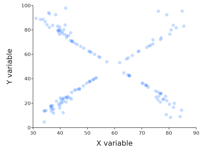
Even though all these data have almost identical statistical values, visualizing them reveals that they are very different distributions.
Without the visualization, a big piece of the story would be missing!
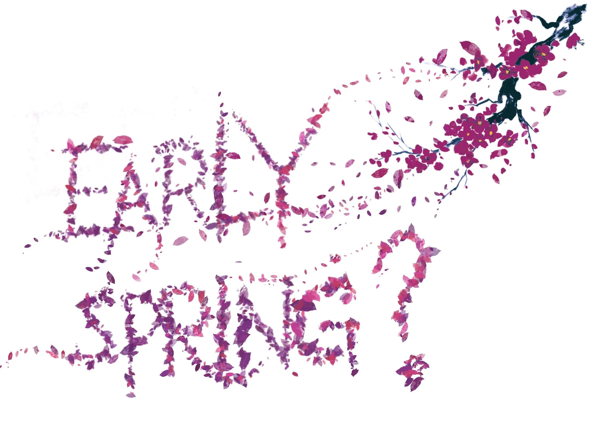
Graphs help ask the right questions.
Data Visualization can shape or refine your question.
Big Idea: Sometimes adding just one more piece of information to a graph
drastically changes the story.
Full Dataset
No significant change over time

Adding a Variable
Visualizing Pre- and Post- Industrial period

Excluding Data
Dramatic change since 1850

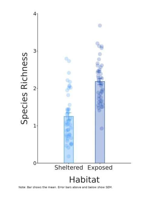
Intentional graphs speak loudly.
Take advantage of color, shape, and overall design to shout your data story from the rooftops.
Big Idea: Data visualization is a bit of an art. Changing elements and scale can draw attention to specific parts of the story.
Before

Ways second graph was enhanced for intentional design:
Complementary color scheme chosen for aesthetics but also to emphasize treatment groups
Gridlines removed for cleaner look
Increased size of axis labels
Error bars accompany any measure of central tendency
Points made transparent when overlapping
Point size enlarged for visibility and to emphasize sample size
Graph orientation to vertical rectangle to highlight difference between groups
Visual (bar) is added to highlight means
X and Y markers enlarged
Variable names on graph chosen for understanding
After

Interested to hear a bit more? Aaron Reedy talks it all out in this recorded webinar! Check out the time stamps below to hear more details:
A dinosaur may be hiding in your data (Timestamp min: 3:27 - 10:50). Find the dataset here.
Graphs help you ask the right questions (min 11:17 - 16:45). Find the dataset here.
Intentional graphs speak loud and clear (min 18:05 - 23:30). Find the dataset here.
Dataclassroom has all the tools to create the best story for data visualization (min 23:40 - 24:50)