Early Spring in Kyoto?
Use this real world dataset that goes back more than 1200 years to explore the effects of climate change on a seasonal natural phenomena.

Background
Each spring the cherry blossoms, “sakura” in Japanese, put on a natural spectacle that has been of major importance to Kyoto, Japan going back at least as far as the 9th Century. Since that time, records have been kept to document the “full flowering date” when the blossoms are at their peak on the cherry trees.
This has made for a very strong dataset to indirectly look at climate change and look for any effect on the timing of season. Explore this dataset to look for any patterns in the data that may reveal a change in the timing of spring in Kyoto, Japan.
Watch this video to see real footage of sakura in Kyoto.
The Dataset
Osaka Prefecture University researcher, Yasuyuki Aono, has compiled a dataset that stretches back to the year 812 by using “diaries and chronicles written by emperors, aristocrats, governors, and monks at Kyoto.”
Variables
Year - This numeric variable is the year that each data point was collected.
Full-flowering date (DOY) - The peak bloom date is defined as the day when ~70% of the cherry blossoms are open. Peak bloom varies annually depending on weather conditions. This is measured in Day Of Year (DOY) where the dates is converted to a number. DOY of 80 = March 21. DOY of 130 = May 10.
Time Period - This categorical variable is used to describe whether a data point was recorded before or after 1850. This is generally accepted to be the point in time when coal began to be burned on an industrial scale with the rise of steam power. The values of this categorical variable are either Pre-Industrialization or Post-Industrialization.
Reference Name - This indicates the primary data source used for that data point in the dataset. This variable is coded as info and can not be graphed.
Activity
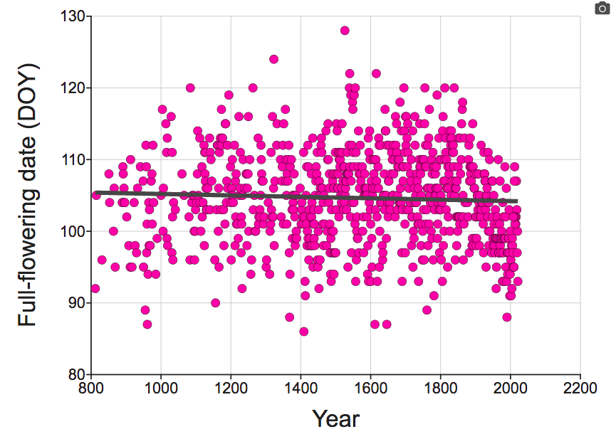
Make a graph with Year on X and Full Flowering Date (DOY) on Y. Add a line of best fit by checking the box for Regression line on the control panel on the right. Paste your graph below:
2. What is the overall trend in the full flowering date over the time period from the year 812 to 2021?
3. Now color code your data points to visually separate the data points from Pre-Industrialization and Post Industrialization time periods. Do this by Showing Time Period as a variable on your graph and adding it as your Z variable.

4. Now change your graph to fit separate lines of best fit for the two time periods. Do this by checking the Group by Z checkbox that appears on your control panel after you add Time Period as your Z variable. Paste your graph below:
5. What is the trend you see when looking strictly at the data from 1850 to 2021? How strong does this evidence appear to you that the data from this time period indicate a trend that is different from the overall trend for the dataset?
6. How do these data offer indirect support for human caused climate change?
7. What are some potential implications for these data for the effects of climate change on agriculture?