Adding Descriptive stats
Quickly add more details to illustrate aspects of your data
Why is this important?
Descriptive statistics, like mean, median and error bars, illustrate specific aspects of data, and are valuable in drawing conclusions or making comparisons.
We have focused on making these easily available, and easy to play with and to switch between the various forms, to encourage the student to think more about which story their data is telling them.
When graphing data for which descriptive stats would be relevant, a single click will instantly add a visual indicator to the graph.


Playing with the data
With a few clicks, the student can quickly experiment with adding various forms of indicator to their data.
By default, we always leave the actual data shown as dots, as we believe this is a more educational way to look at the data. (You can turn the dots off if you want, though).
Report-ready presentation
Ever seen a student report downgraded because it was missing some vital information?
Together with the visuals, the graph shows annotations that tell the reader exactly what they are showing - and they can also easily add the actual numbers as a table to their report, so nothing gets missed.
The side benefit to this is that the student, if they are unsure, can easily read up on what is being shown and learn what the appropriate terminology is.

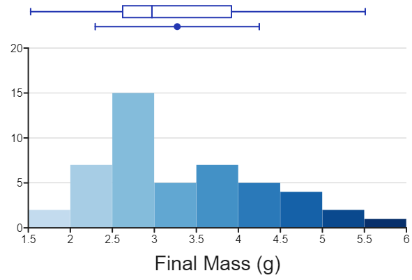
Histogram or dot plot?
If the student wants to show their data as a histogram, the same descriptive statistics indicators are available there too.
The result
DataClassroom makes it trivially easy for students to add descriptive stats to their graphs, and does it in a way that allows rapid experimentation and comparison of the various options.
A student using it has:
Thought about the various kinds of descriptive stats
Seen their relation to the “shape” of their data
Seen a number of options, some of which may be new to them
Decided which visualization works best for them
Conclusion
We believe passionately that the best learning experience is one that takes place between a teacher and their students.
But also that this experience can be improved by carefully designed tools, that focus not only on getting results but on providing learning opportunities, building student intuition and supporting the teacher by encouraging the students to experiment and learn by doing.