Why won't my graph work?
How to make data tidy with the new Melt, Uncount, and Count tools.
This material was originally presented as a webinar by Dr. Aaron Reedy in March 2026. No recording of the webinar exists, but this is a summary of the material presented in that webinar .
When a student says "I can't get my graph to work," the problem is almost never the graphing software. It's usually that the data isn't in tidy format. Once students understand this, graphing becomes much easier.
This post explains what tidy data is and how three tools in DataClassroom — Melt, Uncount, and Count — can transform messy datasets into analysis-ready tables using real example datasets.
What is Tidy Data? (And why should students care?)
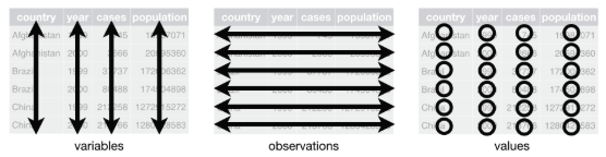
Tidy data is a standard way of organizing datasets so that computers and statistical tools can work with them efficiently.
A tidy dataset follows three simple rules:
One variable per column. Each column represents exactly one thing being measured or recorded.
One observation per row. Each row is a single data point — one plant, one cell, one fruit fly or one tube.
One value per cell. Each cell holds a single measurement or category.
Two questions help students self-diagnose any formatting problem: "What are your variables?" and "How many total observations do you have?" The answers almost always reveal the fix.
Quick Reference: Which Tool Do You Need?
Melt — Values of the same variable spread across multiple columns → combine into one.
Uncount — Summary tallies in a row → expand into one row per individual observation.
Count — Individual rows → collapse into grouped counts (that all come from a single observation) for analysis.
The Melt Tool: The Most Common Fix for Untidy Data
What Is Melt?
When to use it: Values of the same variable are spread across multiple columns (wide → long format).
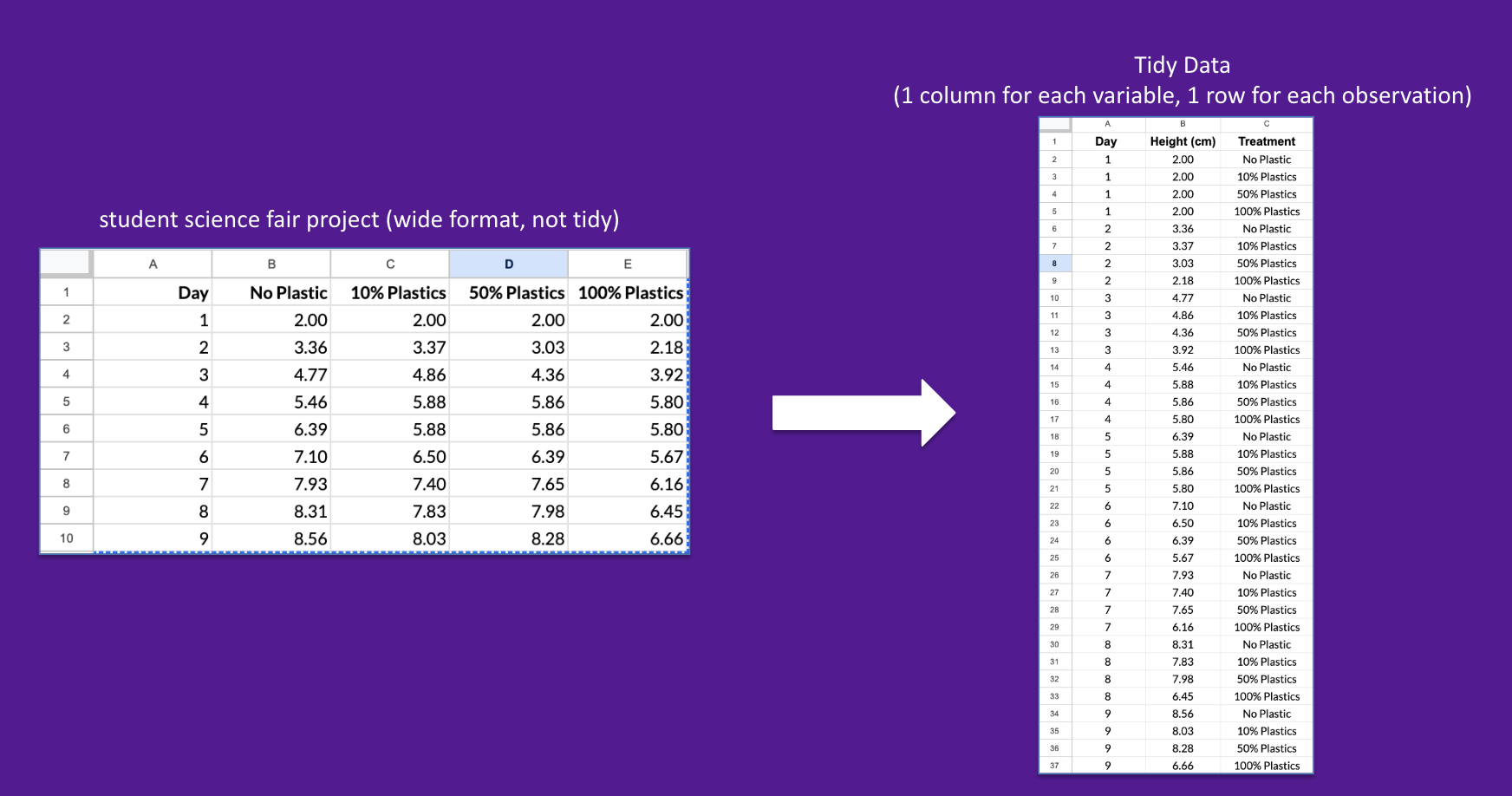
Melt takes data from wide format to tidy (long) format.
How to Use Melt in DataClassroom
This clip shows you a fast and easy way to tidy data using melt function:
Go to ☰ Advanced Tools → Tidy Format (Melt)
Select the columns that contain values of the same variable (all four treatment columns).
Name the category column ("Plastic Treatment") and value column ("Height (cm)").
Click Convert. An Undo button is available if needed.
The Uncount Tool: Turning Summary Tallies Into Independent Observations
What is Uncount?
When to use it: Students recorded data as summary counts initially and need one row per individual observation for graphing and analysis.
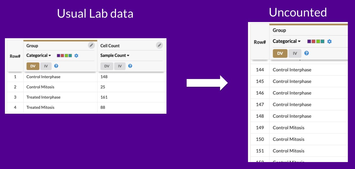
Uncount takes the summary table containing 422 observations and turns into into a tidy dataset with a single column and 422 rows.
How to Use Uncount
This clip shows you a fast and easy way to tidy data using the Uncount function:
Go to ☰ Advanced Tools → Uncount.
Select the column which is “counted” but you wish to separate out into individual rows
Click Convert. An Undo button is available if needed.
The resulting data table lists each sample count as its own row.
The Count Tool: Grouping Observations (And Getting Statistics Right)
What Is Count?
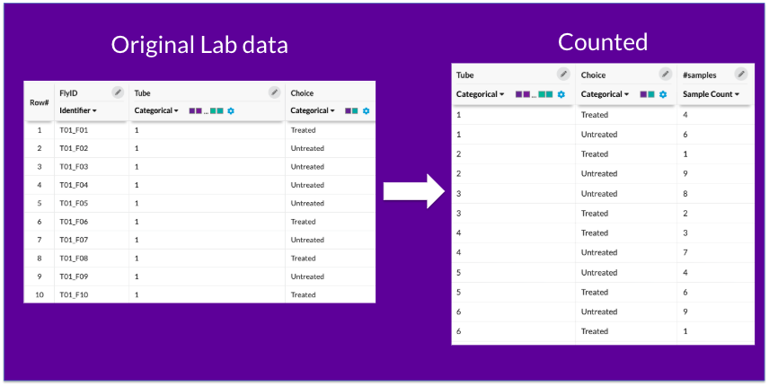
When to use it: Individual observations need to be collapsed into grouped summary counts before analysis.
How to Use Count
This clip shows you how simple it is to combine data using Count:
Go to ☰ Advanced Tools → Count.
Select the variable which you want to combine. It could be more than one variable! It will combine them all in one step.
Click Convert. An Undo button is available if needed.
For this example, the resulting data collapses 300 rows of data down to 60 (two rows per tube, treated and untreated counts)
The Science Gets Easier When the Data Is Tidy
Teaching tidy data for students isn't just a formatting exercise — it deepens understanding of experimental design. When students ask "what are my variables?" and "what is my unit of observation?", they're thinking like scientists.
Looking for even more info on DataClassroom Tidy Tools? Check out our User Guide here