New Features – February 2020

We know that your lessons are continually getting better with each iteration. Your First Period class does not always get the same polished lesson that your Sixth Period class does, because you are always reflecting and trying to get better for your students. Just like you, we are always reflecting and working to get better. Here are our latest.
Graph Driven
Hypothesis Test

We heard you loud and clear on this one. You loved the animated hypothesis tests that we have for T-test and Chi-Square, but those of you who wanted to push your students beyond those two tests were looking for more statistical tests. You wanted more tests and you wanted a little guidance for your students on which tests were a fit for variables of different types. The new the Graph-Driven Hypothesis Test is for you. More on the How To page.
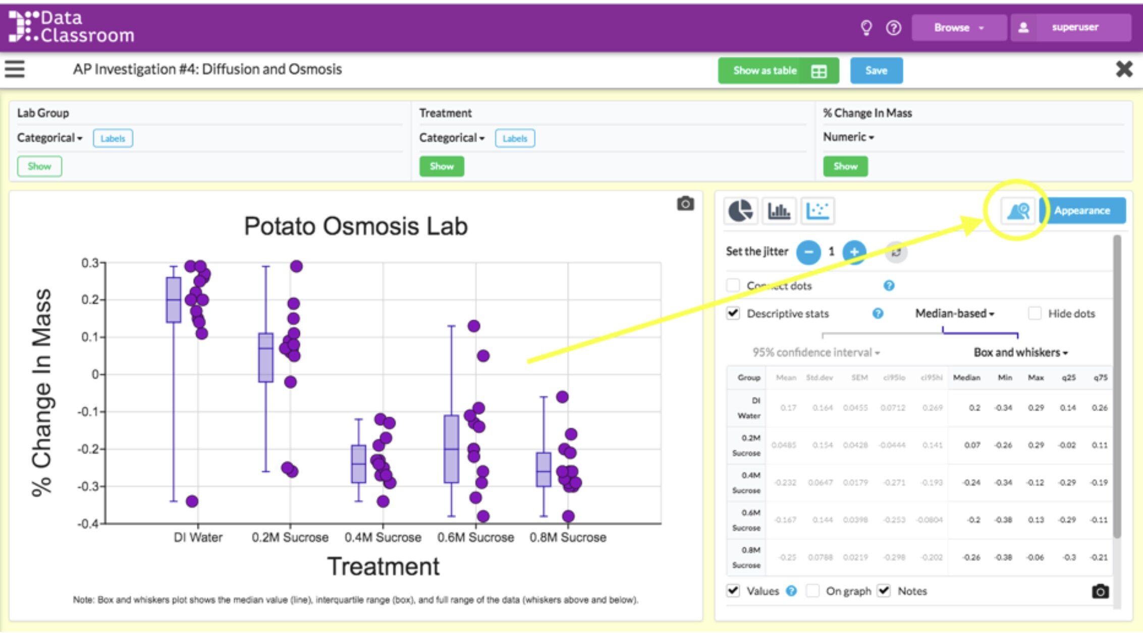
Available right now in Graph Driven Test: Linear Regression, T-test, ANOVA
Coming soon: Chi-square Goodness of Fit and Test of Independence, 2-Way ANOVA
Fetch Data Directly from Google Sheets
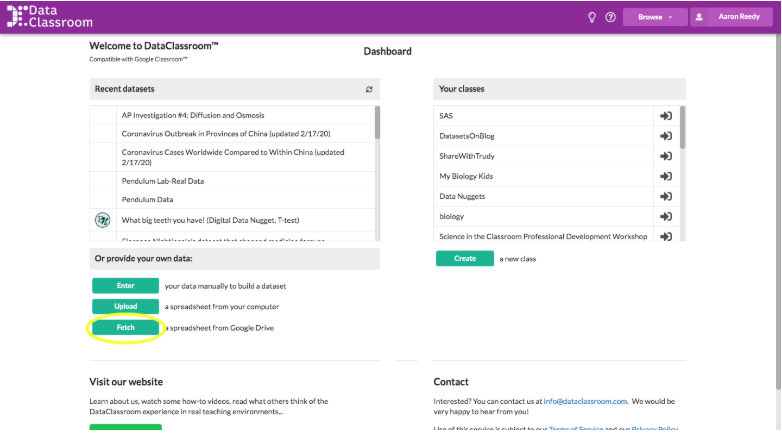
Many of you use Google Sheets almost daily with your students. It is your go-to for recording class datasets with your students. You love how students from multiple classes and lab table-groups can upload data to the same Sheet. Now you can easily Fetch that data into DataClassroom and update it when you make changes to that Sheet.
The Fetch from Google Sheets button is located on the dashboard right below your recent datasets list. Simply open the Sheet in another tab, copy and paste it into that field. You can even reload the Sheet when you make updates in Google Sheets. All the spreadsheet capabilities of Sheets can now be combined with the graphing and visuals of DataClassroom. More on the How To Page.

It is Now Easier to Exclude Rows
We knew that there are always reasons why you might want to exclude data points. You have a crazy outlier, you know you didn’t follow procedure for a particular observation, or maybe you just want to make a graph of a subset of your data. Originally, we thought it would be best for students to record this reason before excluding a row. Turns out you disagreed!
In the data table view you can see a little check box on the right edge of each data row.
Check that box and the data from that row will be excluded from all graphs and hypotheses tests that you do. Uncheck it and you get the data point back. No explanation needed.
Let us know what you think
See somewhere where you think we can do better? Let us know about it. Just like you, we always want to get better.