Florence Nightingale: Data Visualization Pioneer
Data have the power to change the world. Today we have the tools to record data and uncover life-changing insights faster than ever. Let's go back in time when the only data tools available were pen and paper. That's all Florence Nightingale needed to change the world forever with her data.

Florence Nightingale – British nurse, social reformer, and foundational philosopher of modern nursing, was also a data visualization pioneer. While Florence Nightingale may be best known for her role as the "Lady with the Lamp," caring for wounded British during the Crimean War, her legacy is also recognized in the field of data analytics and visualization. The Lady with the Lamp was also the lady who conducted pioneering and brave work as a statistician during a time when women were a rare presence in such fields. Florence Nightingale, one of the most noteworthy applied statisticians in history, used her passion for statistics to save lives of soldiers during the Crimean War, and do groundbreaking work in data visualization that continues to be influential to this day.
When Florence Nightingale arrived at the British military hospital in Turkey in 1856, the scene was pretty grim. The mortality rate was high, and the hospital was chaotic — even the number of deaths was not recorded correctly. Upon her arrival, the hospital was overcrowded, unsanitary and lacked medical supplies. Within six months, Nightingale and her team of 38 nurses transformed the hospital and the death rate dropped from 40 percent to 2 percent because of her work. All the while, Florence was recording data.
By collecting data, Nightingale learned that poor sanitary practices were the main culprit of high mortality in military hospitals. She was determined to curb such avoidable deaths. By using applied statistical methods, she made a case for eliminating the practices that contributed to an unsafe and unhealthy environment. Her work with data saved lives.
“It is as criminal to have a mortality of 17, 19, and 20 per thousand in the Line, Artillery and Guards, when that in civil life is only 11 per 1,000, as it would be to take 1,100 men out upon Salisbury Plain and shoot them. ”
Data Visualization
Once back in England, Nightingale created visualizations for her data. She created bar charts, stacked bars, honeycomb density plots, area plots, and her famed collection of polar-area diagrams often called coxcomb plots. Nightingale used the coxcomb to depict the effectiveness of the sanitary improvements she enacted at the British soldier hospital during the Crimean war. Her visualizations go beyond traditional descriptive nature in tables and were designed to indicate the necessity of healthcare reform. At the time, England's Chief Medical Officer, John Simon, had asserted that, "the great mortality from important classes of zymotic (infectious) disease is practically unavoidable."

Her most famous design, which we use in varying forms today, was the “coxcomb.” The coxcomb is similar to a pie chart but more intricate. In a pie chart the size of the ‘slices’ represents a proportion of data, while in a coxcomb the length, which the slice extends radially from the centre-point, represents the first layer of data.
The specific organization of Nightingale’s chart allowed her to represent more complex information layered in a single space. In her coxcomb during the Crimean War, the chart was divided evenly into 12 slices representing months of the year, with the shaded area of each month’s slice proportional to the death rate that month. Her colour-coding shading indicated the cause of death in each area of the diagram.

Nightingale is an enduring role model in the field of statistics. Today we know data careers are growing in nearly every type of industry, but Florence Nightingale’s groundbreaking work came long before the use of data in medicine was commonplace. Often called the founder of modern nursing, she will long be remembered for her trailblazing work in statistics.
Activity:
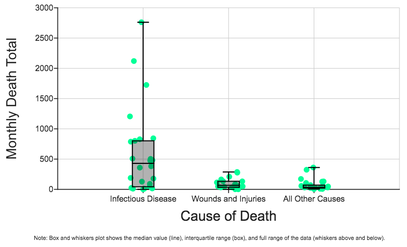
First plot the raw data from Nightingales notebooks to compare the number of deaths of British soldiers from different causes during the Crimean war. Show Monthly Death Total on the Y-axis and Cause of Death on the X-axis. Each data point represents an individual monthly death count for a specific cause of death.
Which cause of death immediately stands out as the biggest cause of death during war time for British soldiers during the Crimean war?
Now make a new plot with Annual Mortality Rate on the Y-axis and keep Cause of Death on the X-axis. Check the box (on the lower right-hand panel) to add Descriptive Stats. Choose the Median-based Box and Whiskers plot. How do these new data and visualization show similar information in a new way, as compared to what you did in question #1? Which visualization do you like better and why?
Compare the box and whiskers plot that you made in question #2, to the “coxcomb” style plot (above) that Nightingale invented to showcase her data and make the argument that improved sanitation of military camps, hospitals, and kitchens could save many lives. Which qualities of the data are best communicated by each type of plot? Which type of plot do you prefer for this dataset? Explain why you prefer that plot for these data.
Sources:
Florence Nightingale British Nurse, Statistician, and social reformer
Florence Nightingale is a Design Hero