Step into the (correlation) Matrix
What is a correlation?
A correlation tells us how strongly the value of one numeric variable is associated with the value of another numeric variable.
Correlation coefficients range from zero to one, with a 1.0 meaning that the value of one variable perfectly predicts the value of another.
What does a correlation matrix show you?
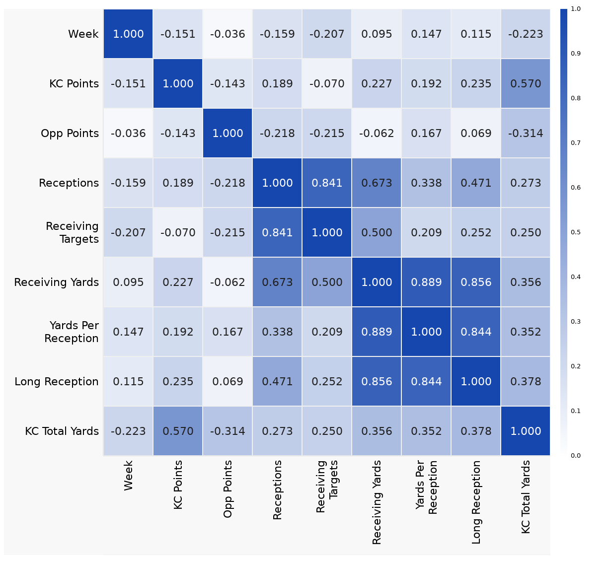
The correlation matrix is a great way to visualize patterns in your data when you have a lot of variables. The matrix shows you the relationships between every pairwise combination of numeric variables in your dataset all at once.
Each of the variables is listed in the same order on the X and Y axes. Each colored square at the intersection of the row and column for two variables shows the strength of the correlation between those two specific variables. Darker colors show a stronger correlation while lighter colors indicate a weaker correlation.
You will notice that there is a diagonal of correlations of strength 1.0 as each variable is perfectly correlated with itself. The two halves of the matrix above and below that diagonal are identical and you often see just one half presented as results.
What can the correlation matrix tell you about your data?
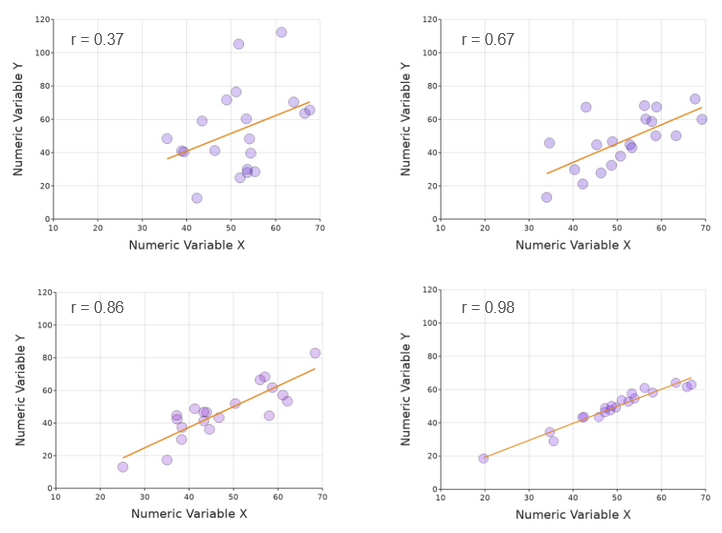
The correlation matrix tells us how closely any one variable predicts the value of any other in your dataset. A high correlation coefficient means that the data points will be clustered relatively tightly around a line of best fit. This can be seen clearly here:
Note that the slope of the line does not affect the correlation coefficient - except that if the line sloped the other way, the correlation coefficient would be negative.
When is it useful?
With the ability to color the squares in the matrix according to the strength of the correlation coefficients, any interesting results visually pop right out of the matrix. This makes a correlation matrix a really good tool for summarizing data from and looking for relationships among a large number of variables.
Sometimes this is because you are exploring a dataset before you have a strong hypothesis and want to know which relationship among variables might be interesting enough to warrant a future experiment. This is often the case when data is collected with large exploratory surveys that aren’t built around a focused hypothesis.
Similarly, a correlation matrix can be the perfect visualization to communicate a complex story efficiently. If you want your audience to see a pattern that is seen over and over again between many variables, the correlation matrix just might be the best way to do that in a single visualization.
How is the correlation matrix built?
Essentially the process involves taking every possible combination of numeric variables and running a mathematical correlation test on all the values collected for each pair, and seeing if there is a relationship in each case. The two main techniques are Pearson and Spearman, and the difference between them is subtle but important.
Pearson vs. Spearman. What’s the deal?
Spearman’s “rho” correlation coefficient tells you how well the values fit the rule “if one goes up, the other also does”. This is done without regard to the actual values, just their ordering. The technical term is “monotonic” - if a curve drawn always tends in one direction, the correlation is perfect, independent of the shape of the curve.
A perfect monotonic relationship - Spearman’s rho = 1
For a survey using a Likert scale, this is useful for ignoring differences in how different people might form their own “scale of 1 to 5”. As long as their “3” is always more than their “2”, Spearman doesn’t care if the jump between 2 and 3 is different for person A compared to person B.
In contrast, the Pearson “r” coefficient tells you how close the relationship is to linear. The perfect relationship is only achieved by a straight line tending upwards or downwards. This would be more relevant for quantitative values, such as measurements.
As the relationship is not linear, the Pearson coefficient here is only 0.85
If there is no real relationship, the samples will be randomly arranged, and the correlations much lower. Depending on the number of samples, the significance of any apparent trend will be adjusted (so with few samples, as in the example below, some kind of slight “trend” is inevitable, but the correlations coefficients will be low).
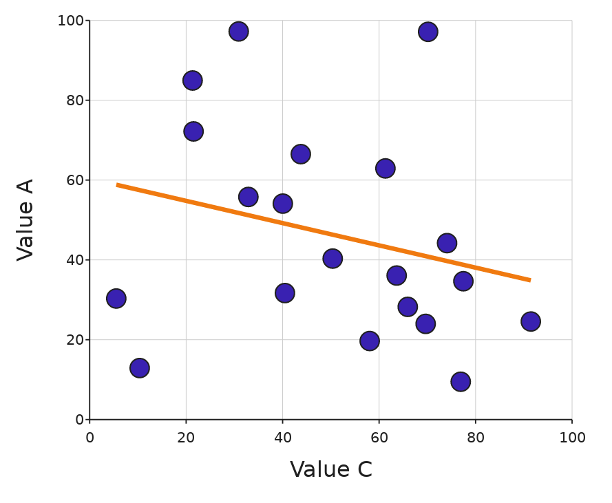
A weak relationship. Here, ‘r’ is 0.07 and ‘rho’ = 0.3.
Potential Pitfall: Beware the “multiple comparisons problem”
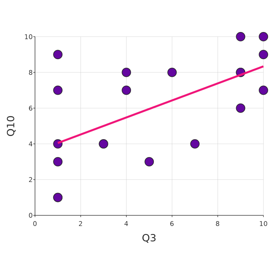
Let’s say you have just done a study with 10 questions, and pull up your correlation matrix and you notice a fairly strong correlation between questions 3 and 10. You dig into the detail and plot a regression line between the two variables and yes - that does indeed look like a real relationship!
You know all about significance and P-values, so you run a linear regression test and right there you have it: a P-value of 0.006! Your fame and fortune are assured. You start to plan your lecture tour where you’ll expand on your surprising discovery.
But - think about it. The P-value expresses the probability that this result was the product of random chance. But you have in fact just run, er … no fewer than 45 separate correlations. That’s how many squares there are in the (half-) matrix, ignoring the diagonal.
That means that … well, it’s actually pretty likely that at least one of your combinations results in a low P-value. With 10 questions, a P-value of 0.05 or lower would be expected to turn up about half the time, even if there is no real correlation in whatever you are measuring. The matrix above was generated from a DataClassroom simulation generating 20 samples of completely random results - and it was the first try. Honest.
You can add the P-values to the matrix in DataClassroom. Here are the raw, uncorrected values from that run - there are indeed several that are under 0.05:
Correcting the P-values
Clearly, we wouldn’t want to mislead. There are various methods that can be used to correct for the “multiple comparisons problem” and so by default, DataClassroom applies the Bonferroni correction (you can also turn it off, to make an image like the above). It is an easily understandable mathematical operation - the P values are simply multiplied by the number of comparisons, which in this case is 45.
That takes our previously significant 0.006 to a not-so-interesting 0.27. And so it has to be (there are other, not so conservative correction methods, but they will have similar effects). It does mean that if you do still see a significant corrected P-value, it should be taken seriously.
And you can of course use the correlation matrix to discover possible relationships or hypotheses to investigate, which can then be investigated in more detail, by collecting more data.
Read more…
Interested? You can have a look in the DataClassroom user guide for more detail on how to make a correlation matrix.
The dataset that made the matrix at the top of this page - with some very strong correlations - is the Taylor Swift Effect Ready-to-Teach lesson dataset, and you can open it in DataClassroom here. It has data from the performance of Travis Kelce and the Kansas City Chiefs in the 2023 NFL season, and unsurprisingly shows correlations between related stats such as “Receptions” and “Receiving yards”.


