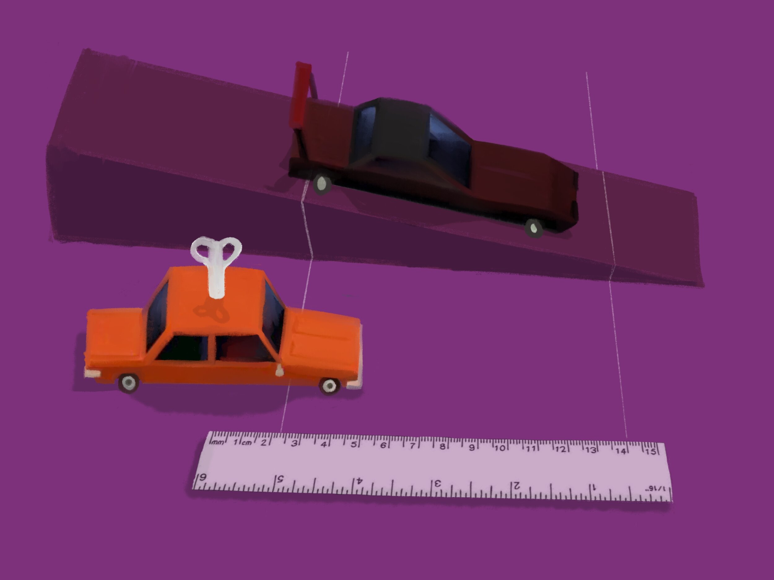
Car and Ramp Labs: Motion on horizontal and inclined planes
Our first Ready-To-Teach Physics activity is a classic introductory lab for both conceptual and upper-level physics that will work as an online version of the classic lab activity.
Background
How can we describe motion? Think of some typical words that are used to describe how a car may be moving...or not. Fast. Slow. Forward. Backward. Speeding up. Slowing down. Turning. Stopping. Going. Now how can we quantify those words and turn them into numbers or even a graph? If we graph a car’s motion, we can learn more about what it’s actually doing.
This is a two-part lab:
Part 1: Car on a Horizontal Track analyzes the motion of a car on level ground or a horizontal track.
Part 2: Car on an Inclined Plane looks at a car moving down a ramp, technically called an inclined plane.
You can do these independently of each other, but it’s best to compare the two sets of results.

Part 1: Car on a horizontal plane
Dataset
To collect these data, a self-propelled toy car was released at the start of a 3 m track that was marked every 0.5 m. When the car passed every 0.5 m mark, the stopwatch lap button was pressed, collecting the split times. Three trials were done. You can copy this lab at home with your own remote-controlled or toy car (or dog or little brother...no one said it HAS to be a car!) and use your own data in the following steps.
A few definitions for the variables:
Interval time: The time it took the car to travel each half meter, measured separately. This is a numeric variable measured in seconds.
Total time: The time the stopwatch would read at each marking if you pressed Start when the car left the zero meter mark and just looked at it each time it passed a mark. This is a numeric variable measured in seconds.
Velocity: The rate at which the car travels in a given direction; Or the change in position or distance traveled over a period of time.
This can be calculated with:
or
... depending on the level of physics you’re doing. This a numeric variable measured in meters per second.


Activity
Use the Make a Graph tool to create a distance versus time graph by showing Distance on the y-axis and Time on the x-axis. You can add Trial # on the z-axis to color code the dots for each trial.
What does the shape or trend of the graph tell you about the car’s motion? What do you think the car was doing? Mess around with Connect the Dots if you need a hint.
Add a Regression Line by checking the box to the right of the graph. What does the slope tell you about this car’s motion? (Hint: remember that slope is rise/run and take a look at what you have plotted on your axes.) Does that number make sense? Why or why not?
Now create a velocity versus time graph by changing your Y-axis to show Velocity. Keep the Regression Line. To make your graph clearer, click Appearance (on the panel to the right of the graph), find Y-axis range and choose Include Zero.
What does the shape or trend of the graph tell you about the car’s motion? What do you think the car was doing?
Look back at the slope of your first graph. How does this compare with this set of data? What does that tell you?
Look at the slope of this graph’s Regression line. Given what’s on the axes now, what does this slope tell you about the car’s motion?
Upperclassmen Extension: What do you think about the r^2 value in the second graph? Considering what you know about the data collection process, what do you think could be done differently in order to reduce the error?

Part 2: Car on an inclined plane
Data Collection
It can be challenging to accurately measure the time it takes a car to travel down a ramp using the same method used in Part 1. But give it a try and compare your data to the following data.
We used a different method: This time, a car was attached to a ticker tape machine. This machine makes a mark on the tape every 0.017 seconds. The car was released from rest at the top of a ramp, which pulled the tape through the timer behind it, effectively marking its position every 0.017 seconds. The distances between each mark were measured.

A few definitions for the variables:
Interval time: The time it took the car to travel each half meter, measured separately. This is a numeric variable measured in seconds.
Total time: The time the stopwatch would read at each marking if you pressed Start when the car left the zero meter mark and just looked at it each time it passed a mark. This is a numeric variable measured in seconds.
Velocity: The rate at which the car travels in a given direction; Or the change in position or distance traveled over a period of time.
Interval distance: The distance measured between each dot, or how far the car traveled in each 0.017-second interval. This is a numeric variable measured in meters.
Total distance: The position of the car at each point in time, calculated by adding the interval distances. This is a numeric variable measured in meters.
This can be calculated with:
or

Activity

Use the Make a Graph tool to create a distance versus time graph by showing Total Distance on the y-axis and Total Time on the x-axis.
What does the shape or trend of the graph tell you about the car’s motion? What do you think the car was doing? Mess around with Connect the Dots if you need a hint.
Add a Regression Line by checking the box to the right of the graph. How well does this line fit the data?
Change the Regression Line type by clicking where it says Linear and choosing Quadratic. Fits better now, right? What does this tell you about what kind of graph you have and what the car is doing?
Now create a velocity versus time graph by changing your Y-axis to show Velocity. To make your graph clearer, click Appearance (on the panel to the right of the graph), find Y-axis range and choose Include Zero.
What does the shape or trend of the graph tell you about the car’s motion? What do you think the car was doing?
Change your Regression Line back to Linear. What does the slope tell you about the car’s motion? (Hint: remember that slope is rise/run and take a look at what you have plotted on your axes.)
Upperclassmen Extension: Go back to the Distance versus Time graph and take a look at that equation for the Quadratic Regression Line. Look familiar? What information does this give you about the car’s motion?
If you’ve completed both Part 1 and Part 2, take a look at both sets of graphs. What type of motion does each car have? How does each pair of graphs represent those two types of motion?