Stellar Stats
Unearthing the H-R Diagram using Star Data

Teacher note: The following activity is very challenging! While there are lots of graphs to work through, we think it is worth the while for students to use data to puzzle through how we know what we know about stars.
Background
Stars are a mystery that we can’t quite get our hands on. Even the closest Star, our Sun, requires us to keep our distance due to the insane temperatures (5,600 ℃ on the surface!). But scientists find themselves asking the question: what CAN we know about stars? And once we do, can we organize all these billions of stars into something that lets us make predictions about other stars?
When we create a pattern for how stars “work”, even if we have some missing information about a star, sometimes we can fill in the gaps. Two scientists set out (each working independently) to design such a method for organization – a Danish astronomer Ejnar Hertzsprung and the U.S. astronomer Henry Norris Russell. With their findings combined, we have what is now famously known as the H-R Diagram.
In this activity, you will investigate different properties of stars and unpack the inner workings of the H-R Diagram. Which variables tell us more or less the same things? Can we know what type of star we are observing just by looking at data? Let’s find out!
Dataset
This dataset was pulled from “Star Dataset to predict Star Types” by Deepraj Baidya on kaggle.com. You can find the dataset here. This dataset or similar datasets commonly appear in astronomy or earth and space science text books.
Variables
Temperature (K) - this numeric variable describes the thermal energy of the star, measured in degrees Kelvin.
Luminosity (L/Lo) - this numeric variable describes the energy of the star in comparison to the sun. It measures the total energy output per second (L) and divides it by the energy output of the sun (Lo). The bigger the number, the more energy it outputs. This number does not rely on our distance from the star. While luminosity has the unit of kJ/s, this comparative value has no unit.
Radius (R/Ro) - this numeric variable describes the radius of the star in comparison to the sun. It measures the radius of the star (R) and divides by the radius of the sun (Ro). The bigger the number, the larger the star. While radius has the unit of kilometers, this comparative value has no unit.
Absolute Magnitude (Mv) - this numeric variable describes the brightness of the star when viewed from a set distance away (10 parsecs) on a logarithmic scale. This allows all star luminosity values to be more easily comparable. The bigger the number, the less luminous the star. The luminosity is taken from the visible spectrum of light and has no unit.
Star Type - this categorical variable describes the the star type. Values include brown dwarfs, red dwarf, white dwarf, main sequence, supergiant, and hypergiant star types.
Star Color - this categorical variable describes the color the star. This color is determined using temperature or brightness measurements. Values include red, white, blue, orange, blue-white, yellow-white, and yellow.
Spectral Class - this categorical variable describes the classification of a star based on its spectral characteristics. Values include M, B, A, F, O, K, G.
Activity
Part 1 - Which variables can we compare to create meaningful patterns?
We want to understand how scientists determine star color, type, and spectral class.
Star Color

Let’s investigate star color through the lens of brightness (Absolute Magnitude). Make a graph of Radius (x-axis) vs. Absolute Magnitude (y-axis). Select star color as your z-axis. Screenshot your graph below:
The data points clearly fall on this graph in a pattern that makes a steep curve (almost and L shape). How does star color relate to the points on the graph?

2) Keep star color as your z-axis. Then, make a graph of Luminosity (x-axis) vs. Absolute Magnitude (y-axis). Screenshot your graph below:
Like our graph before, the data create a slope-like pattern. How does star color relate to the points on the graph?

3) Keep star color as your z-axis. Then, make a graph of Temperature (x-axis) vs. Absolute Magnitude (y-axis). Screenshot your graph below:
How does star color relate to the points on the graph?
4) Look at your answers to #1, 2 and 3. Make a statement relating star color to the variable which created a pattern: Ex: As ____ increases, color changes from…to…
Spectral Class

5) Select Spectral Class as your z-axis. Let’s again investigate spectral class through the lens of brightness (Absolute Magnitude). Make a graph of Radius (x-axis) vs. Absolute Magnitude (y-axis). Screenshot your graph below:
Do you feel this graph displays a pattern for spectral class?

6). Keep Spectral Class as your z-axis. Then, make a graph of Luminosity (x-axis) vs. Absolute Magnitude (y-axis). Screenshot your graph below:
Do you feel this graph displays a pattern for spectral class?

7) Keep Spectral Class as your z-axis. Then, make a graph of Temperature (x-axis) vs. Absolute Magnitude (y-axis). Screenshot your graph below:
Do you feel this graph displays a pattern for spectral class?
8) Make a statement relating star color to one of our quantifiable variables: Ex: As ____ increases, spectral class moves from…
Ex: Spectral class of a star is correlated to _____
Fun fact! Spectral classes used to be alphabetical order, but were organized based on strength of spectral lines as viewed here on Earth. Now that we know a more informative way to organize spectral class (as related to your answer in #8), scientists re-organized it and the letters themselves are no longer alphabetical, and have to be memorized in nonsense ways - like “Oh, Be A Fine Guy/Girl, Kiss Me!”
Star Type

9) Select Star Type as your z-axis. Let’s again investigate star type through the lens of brightness (Absolute Magnitude). Make a graph of Radius (x-axis) vs. Absolute Magnitude (y-axis). Screenshot your graph below:
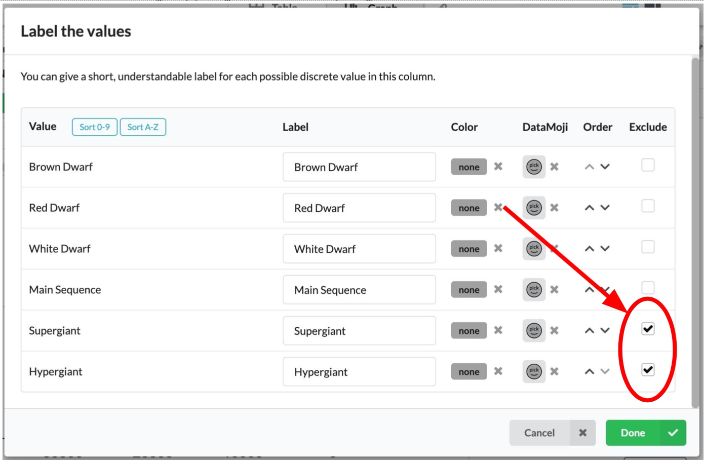
10). This graph (from #9) has sections that you may want to zoom in on. Slowly exclude one star type at a time, starting with the largest (Hypergiant) and working your way down in size. You can do this by clicking on the Values button next to the header for the Star type variable. Screenshot each version of your graph below (expect between 3-4 images)
11) Do you feel this graph displays a pattern for star type?

12) To the right, summarize which qualitative and quantitative terms relate:
Part 2 - Investigating the H-R Diagram
We are now going to explore the most famous graph describing how stars are organized (the Hertzsprung-Russell Diagram).

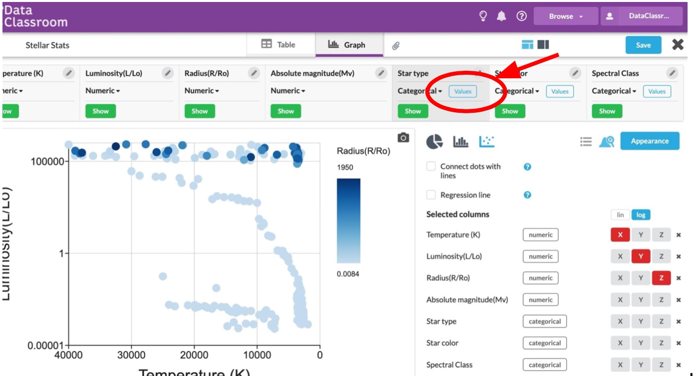
13) First, switch up your graph. Make sure all the things you previously excluded are back on your graph (uncheck the exclusions). Create a graph of Temperature (x-axis) vs. Luminosity (y-axis). Click log to make your y-variable a logarithmic scale instead of linear. Screenshot your new graph below:
We are on our way to getting an H-R diagram, but are still missing a few elements. If the H-R Diagram looks like this graph…

14) What changes need to be made to your graph in order to get these to match as closely as possible?


15) Create the changes you mention above and screenshot your graph below (click here on help how to reverse an axis):
16) This graph can tell us a lot about a star, even without the data explicitly on the graph itself.
Use your graph to fill in the gaps in our star descriptions below (use the extremes of large / small, or red / blue)

17) To confirm our predictions, select radius as your z-axis. Screenshot your graph below:

18). This graph has such extreme numbers, it’s helpful to exclude the two largest types of stars (Hypergiants and Supergiants). Even though star type isn’t displayed on the graph, you can do this by:
Selecting “values” under star type, and then excluding Hypergiants and supergiants:

After you have excluded these datasets, screenshot your graph below:
19) What trends do you see with Radius, Luminosity, and Temperature? Exclude more star types if you need more evidence for your answer. Include a screenshot if you want to use it as further evidence for your answer.

20) For your final graph, replace luminosity with Absolute Magnitude on the y-axis (you will need to remove the log transformation of the axis). Screenshot your graph below (you can keep radius as your z-axis for now):

21) Adjust your graph (think about reversing axis) so that it matches the shape of the H-R diagram we know and love. Select star color for z-axis. Screenshot below:

22) Now select spectral class for z-axis and screenshot below:
23) Relate absolute magnitude, star color, and spectral class together.

24) Lastly, relate absolute magnitude and luminosity (looking at the graph from #23 and #18). What would a graph look like to back up your assertions? Put Absolute magnitude as y-axis, and log of Lumonisity on the x-axis. Make that graph and screenshot below: